AikiRooster
Tube Monkey USMC
Exactly, Seno.
I think we need BATMAN to get to the bottom of this.
I think we need BATMAN to get to the bottom of this.
My argument in a nutshell. In the mean time I will continue to act in accordance with my own experience.
For all of the accumulated knowledge and scientific papers written by and available to the experts, I find it frustrating that I seem to get it right at least as often as they do, without spending millions,... billions of dollars.
I dunno that the problem is the politicising, so much as hungry groups scrabbling for research money. There's an almost bottomless money pit there, if you can just panic the population enough to force the government to do be seen to do something about it.
Perhaps it's just the pessimist in me, but I feel that if the crisis were as bad as some would have us believe, every major energy corporation and food producer would be out there raising their own venture capital to find solutions. Because if they do succeed, they would have a licence to print their own money.
More Doubts
The greenhouse signature is missing. We have been looking and measuring for years, and cannot find it.
Each possible cause of global warming has a different pattern of where in the planet the warming occurs first and the most. The signature of an increased greenhouse effect is a hot spot about 10km up in the atmosphere over the tropics. We have been measuring the atmosphere for decades using radiosondes: weather balloons with thermometers that radio back the temperature as the balloon ascends through the atmosphere. They show no hot spot. Whatsoever.
Senojekips/ Monty Not sure what all this complex discussion on Fourier analysis is for (waves). The graph Senojekips posted was for Central England, what relevence is this? As Monty said in one of his other posts the trend since the industrial revolution and particularily for the last few decades has been highly marked on a global level. To dismiss this as a natural trend is crazy, dare I say irresponsible.
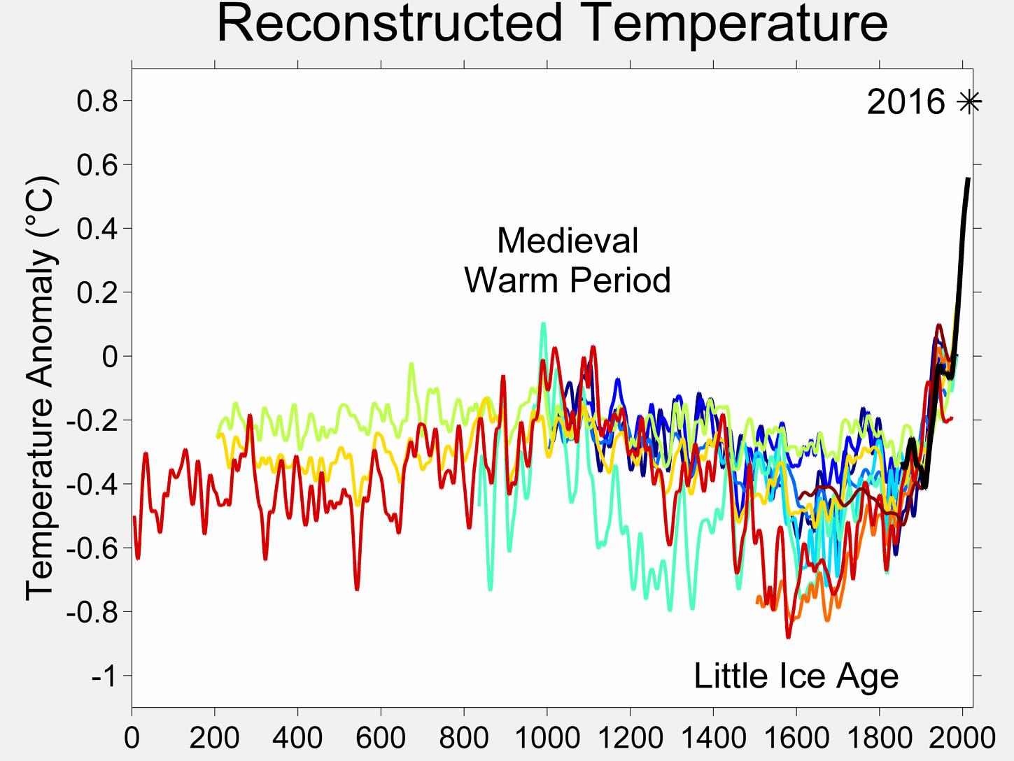
Two millennia of mean surface temperatures according to different reconstructions, each smoothed on a decadal scale. The unsmoothed, annual value for 2004 is also plotted for reference.
http://en.wikipedia.org/wiki/Global_warming
We may have many things. All of which have happened before, and will no doubt happen again. Maybe we are just lucky enough to be experiencing such a change now.We may not even have summer ice at the pole within a few decades.
The CET is relevant, because it is the only set of actual (not extrapolated or interpreted) temperature measurements available in the world for the period we were talking about.
The history of reliable temperature measure is short and a world wide effort in measuring world temperature is at best fifty years old. At BEST.
The graph in that sense is very misleading. It's basically a series of theories and estimations that have been plotted as if they were raw data collected by averaging temperatures of the earth through instruments at least as accurate as a regular thermometer.
Not to mention it matters WHERE you put the instruments.
Were the early measurements taken mostly in monestaries which like to be in high ground where the temperature is cooler?
Are the locations of the instruments the same and whereas before they used to be in the countryside, these areas are now urbanized and therefore the urban heat island effect has come into play?
All those things that the graph does not explain.
Still I can only see the long term trend the rest is noise.
Still not as accurate as walking outside, picking the right spot and taking an actual reading.
Scientists are wrong quite often, what makes you think they're 100% on this one?